gorin
Type Design Typography Editorial Design
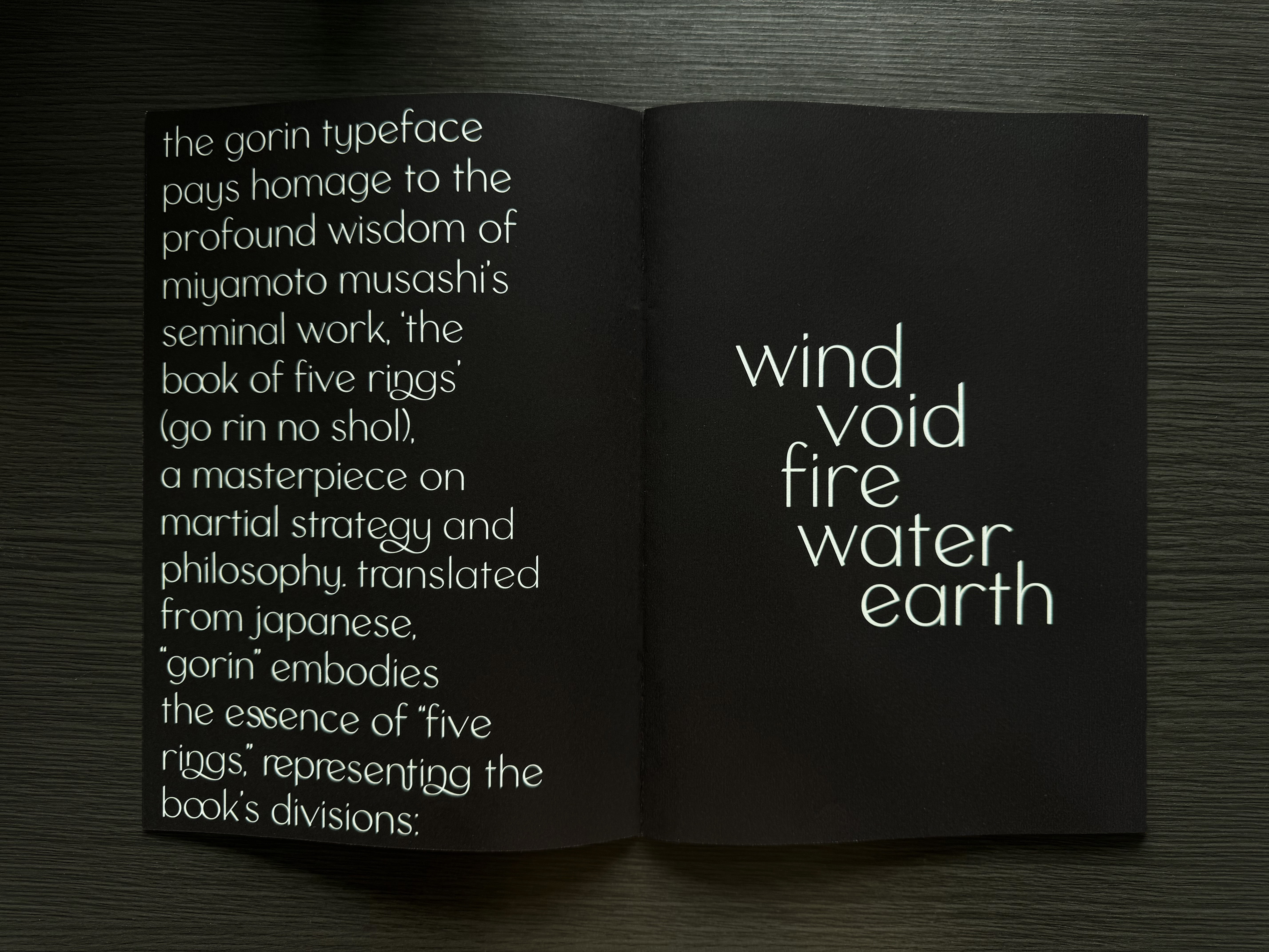
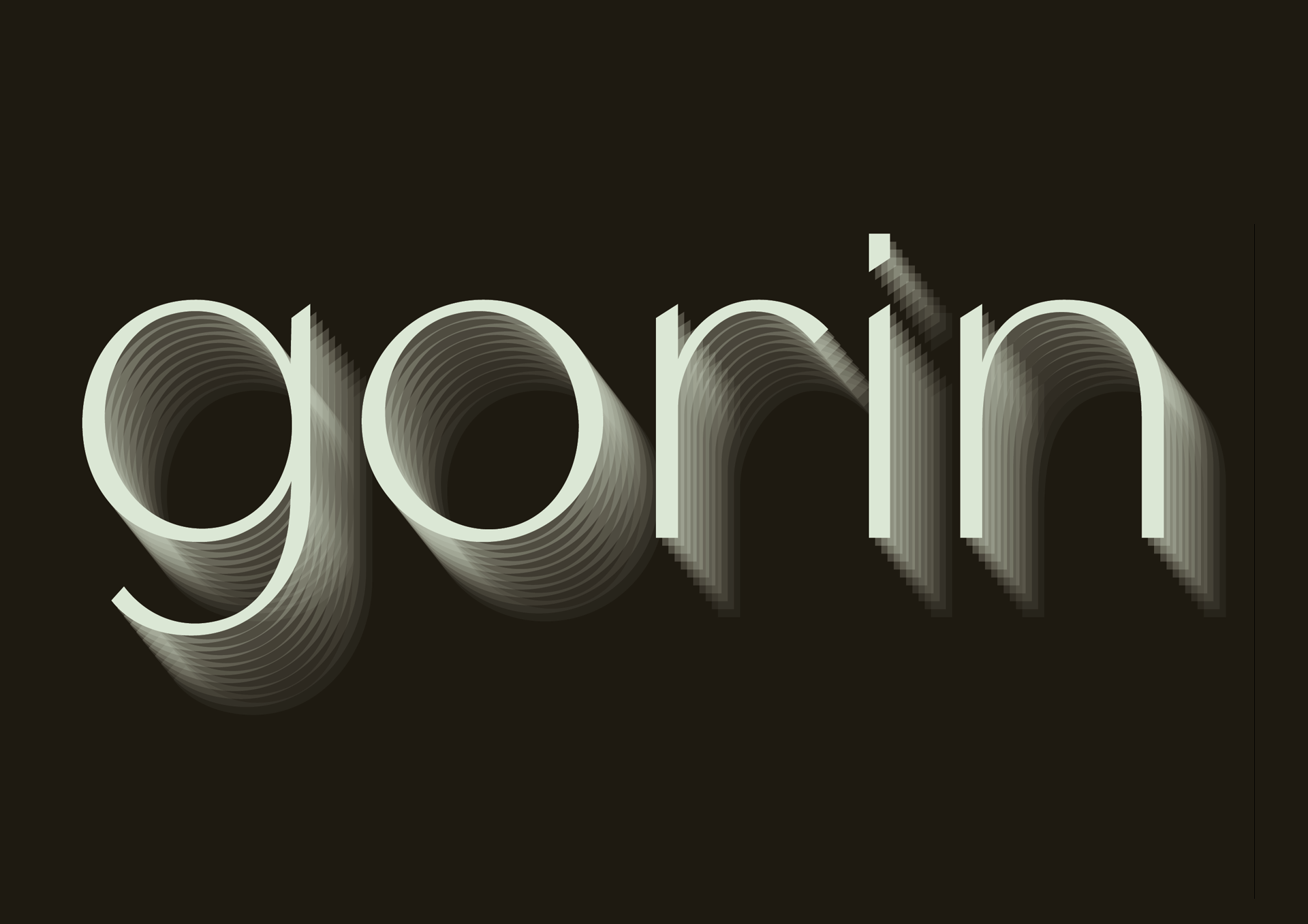
Gorin, a typeface inspired by Miyamoto Musashi's "The Book of Five Rings" (Go Rin No Sho), seeks to encapsulate the profound wisdom and intricate martial philosophy of this classic work. The challenge was to create a typeface that embodies the book's essence—Earth, Water, Fire, Wind, and Void—while translating these concepts into a cohesive visual language. This required a design approach that not only respects the source material but also integrates the martial themes seamlessly into the typeface.
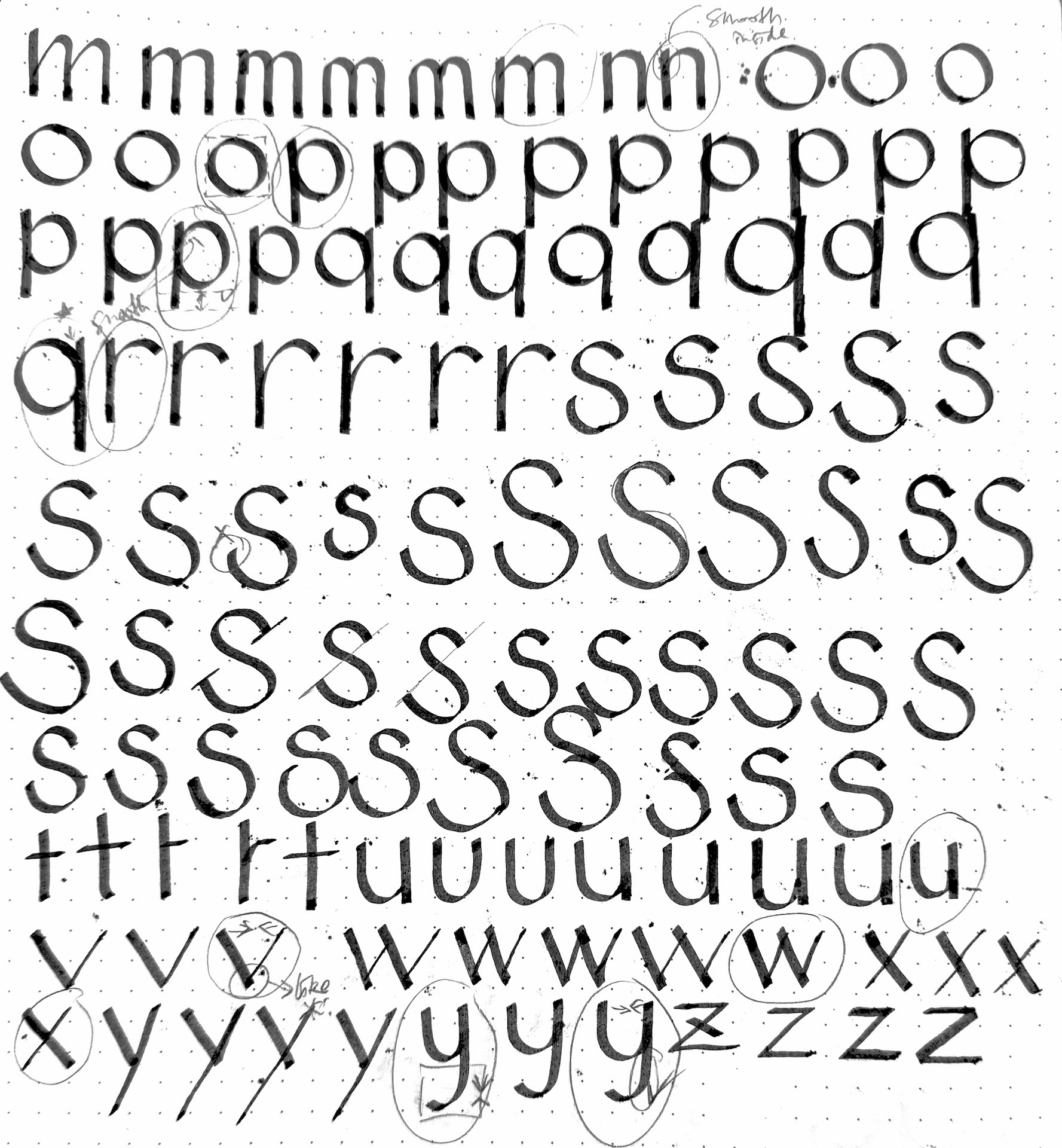
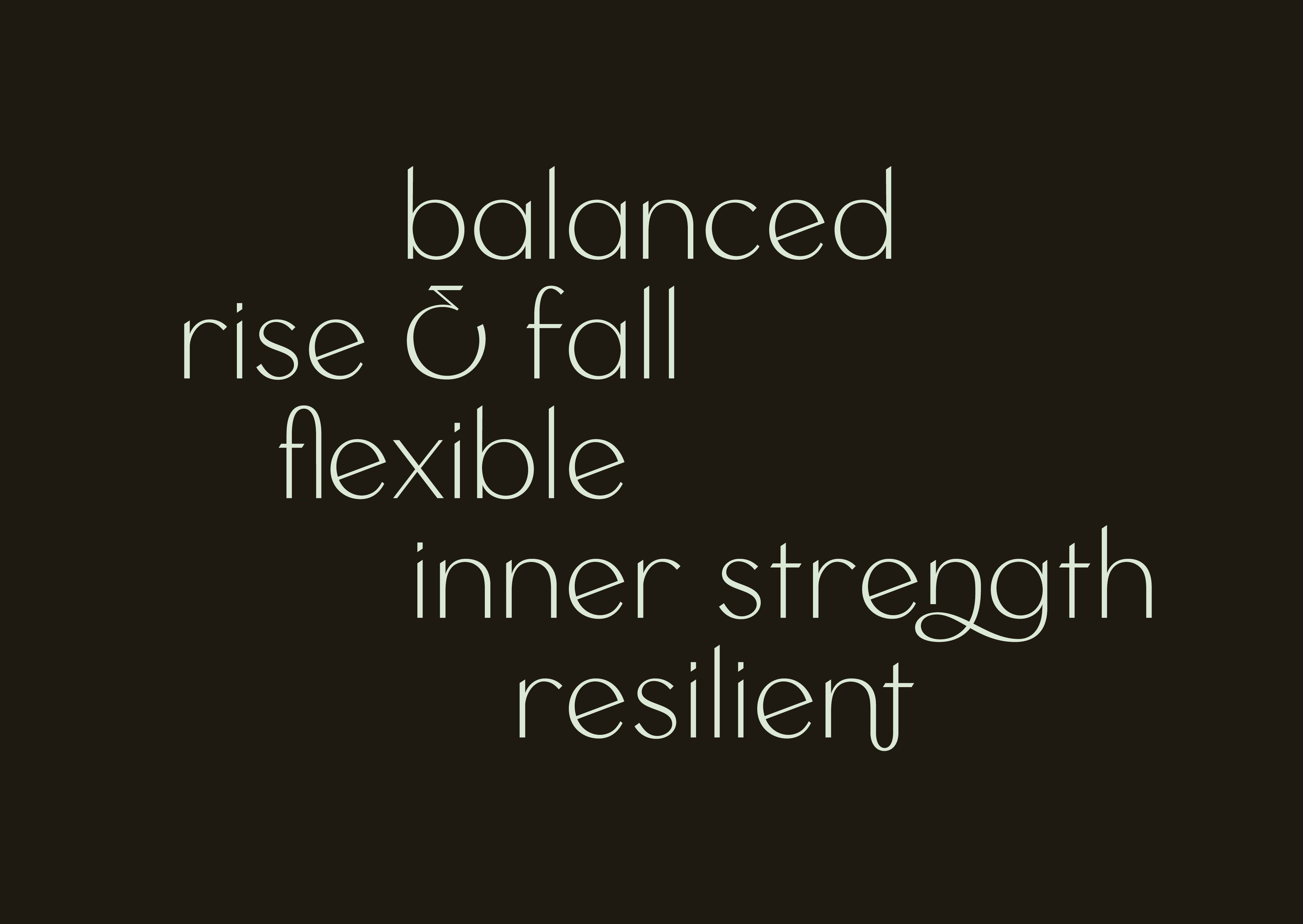
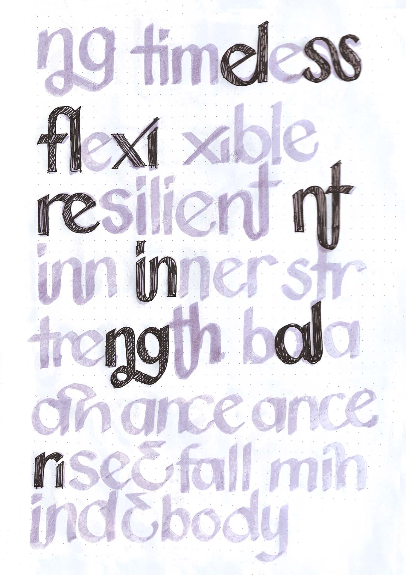
The insight guiding Gorin's design is rooted in the principles of resilience and stability, crucial for a fighter in combat. The typeface's core structure features a tilted counter, symbolizing the chaos often encountered in battle. This design choice necessitated a solution to balance the glyphs harmoniously around this tilted element. The resulting characteristics, such as a low center of mass and diagonal cuts on the ascenders, mimic the grounded stance and precise movements of a swordsman, ensuring that the typeface remains stable and dynamic.
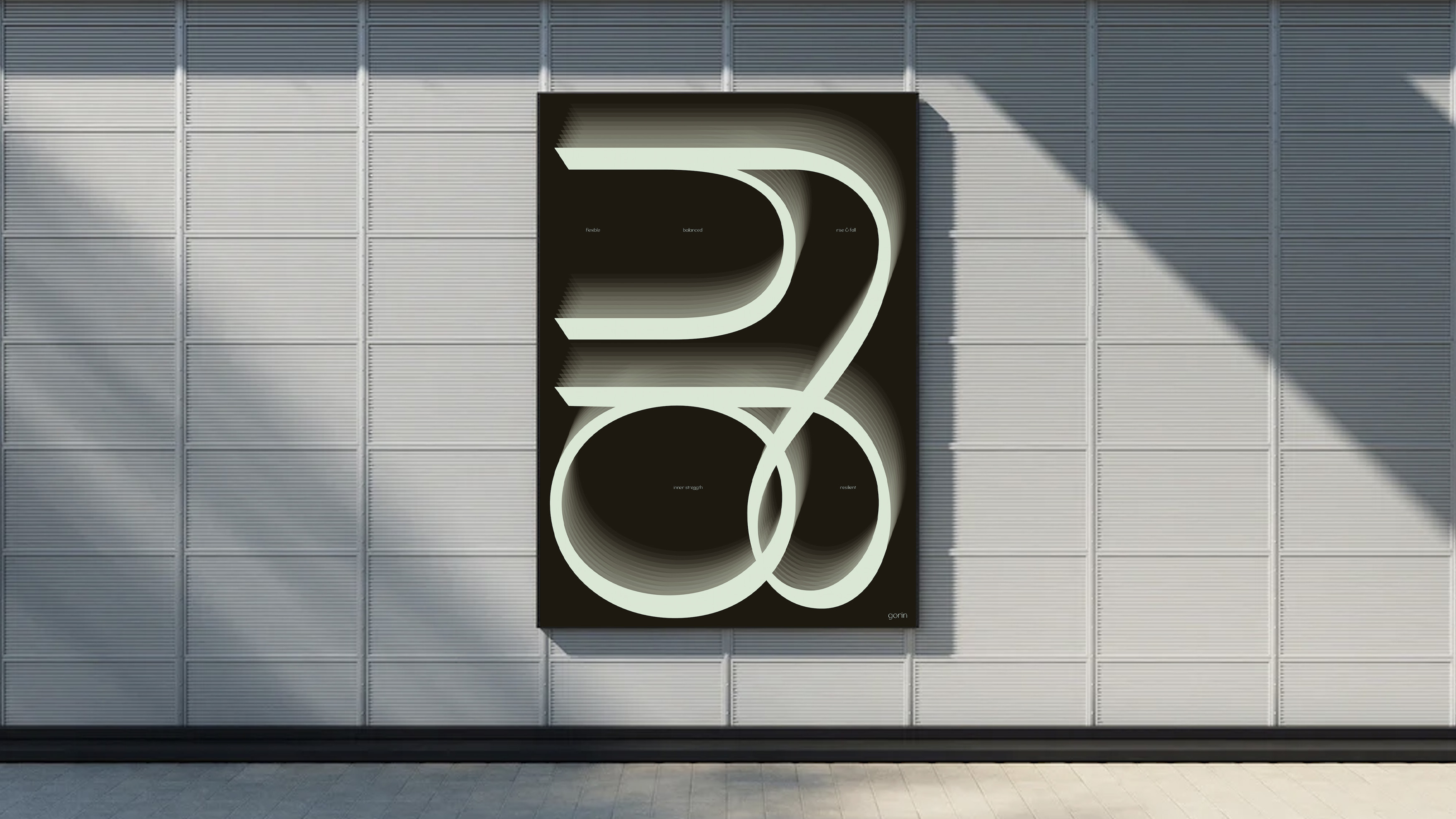
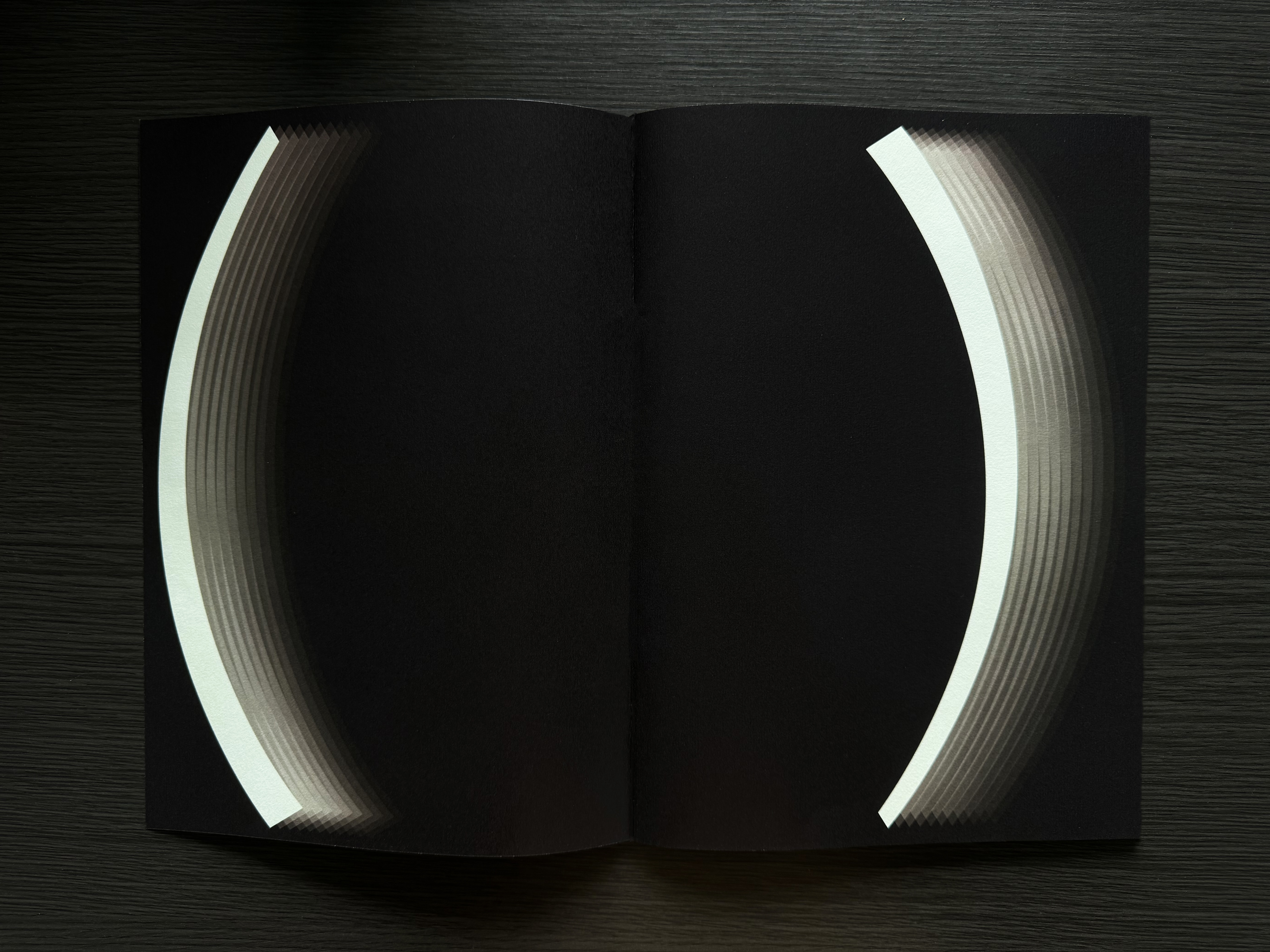
To effectively showcase Gorin's versatility and dynamic qualities, an A1 poster and a type specimen booklet were created. These materials aim to convey the typeface's adaptability through the depiction of combat scenarios and the fluidity of motion. The booklet uses contrasting colors to highlight the essence of fighting, with a mint green background in the middle sections adding a fresh perspective against darker backgrounds. This approach not only demonstrates Gorin's flexibility but also captures the energy and intensity inherent in martial arts.
