space
Letterpress Motion Design Type Design
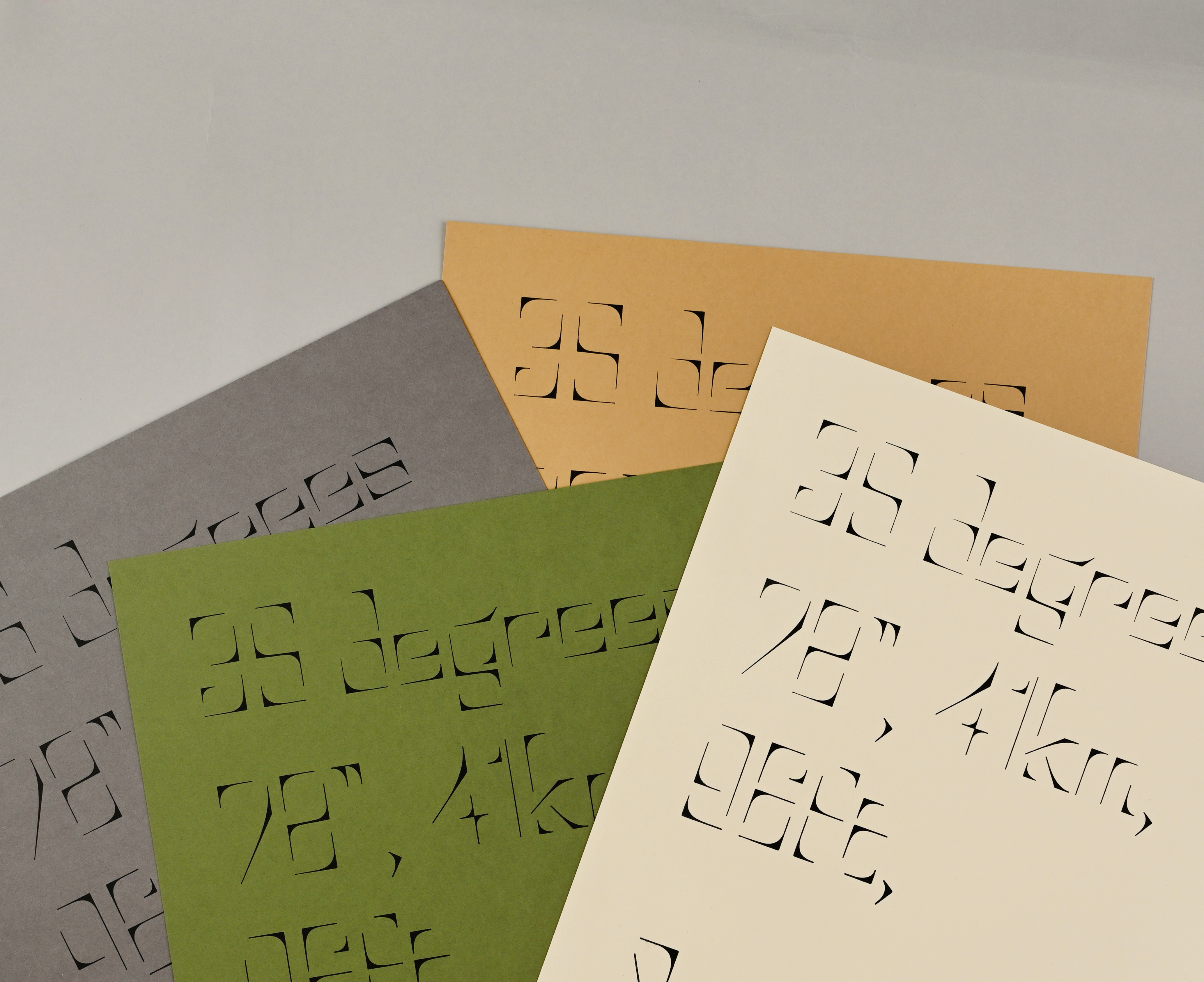
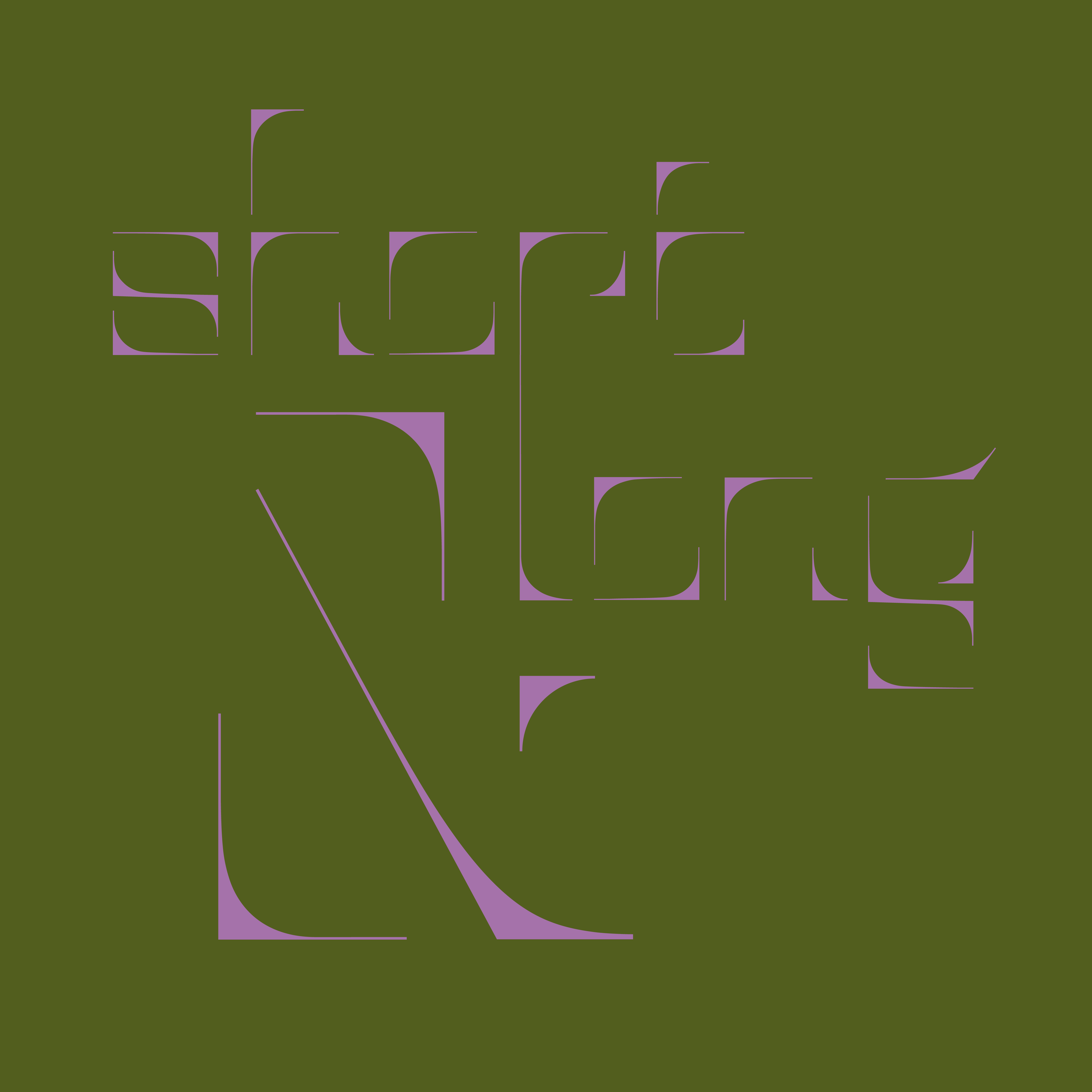
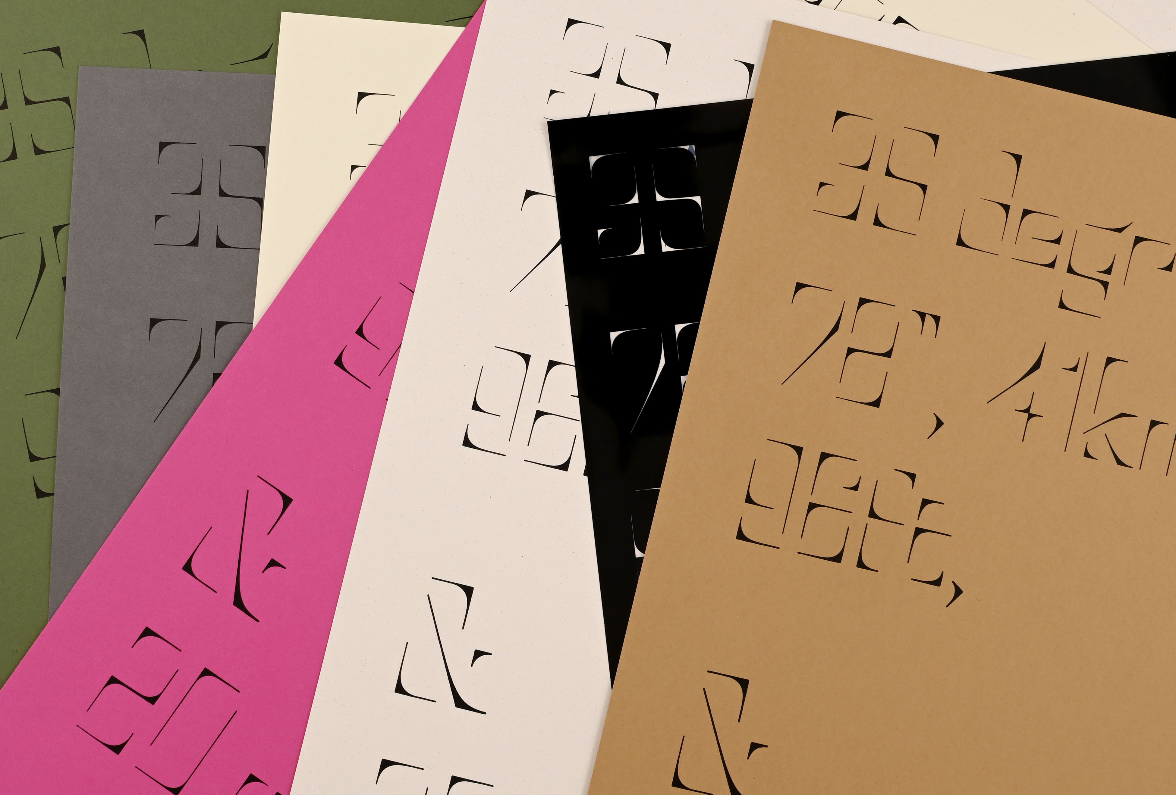
The space typeface was inspired by photographs of intriguing spaces. The problem observed was how thresholds and corners significantly impact space composition, defining wide and confined areas. This observation highlighted the role of corners in shaping the perception of space.
The insight led to the idea of creating a typeface from these corner elements. By incorporating contrasting angles and strokes that fade into the air, the typeface captures the essence of corners while disregarding traditional boundaries. This design approach emphasizes the power of corners in defining space without being constrained by them.
The solution was to print the typeface using letterpress, where the act of mark-making becomes prominent. Printing these corner-based glyphs on paper creates the effect of adding frames, thus imposing a definition on the open space of the sheet. This method underscores the typeface's unique ability to both define and transcend spatial boundaries.