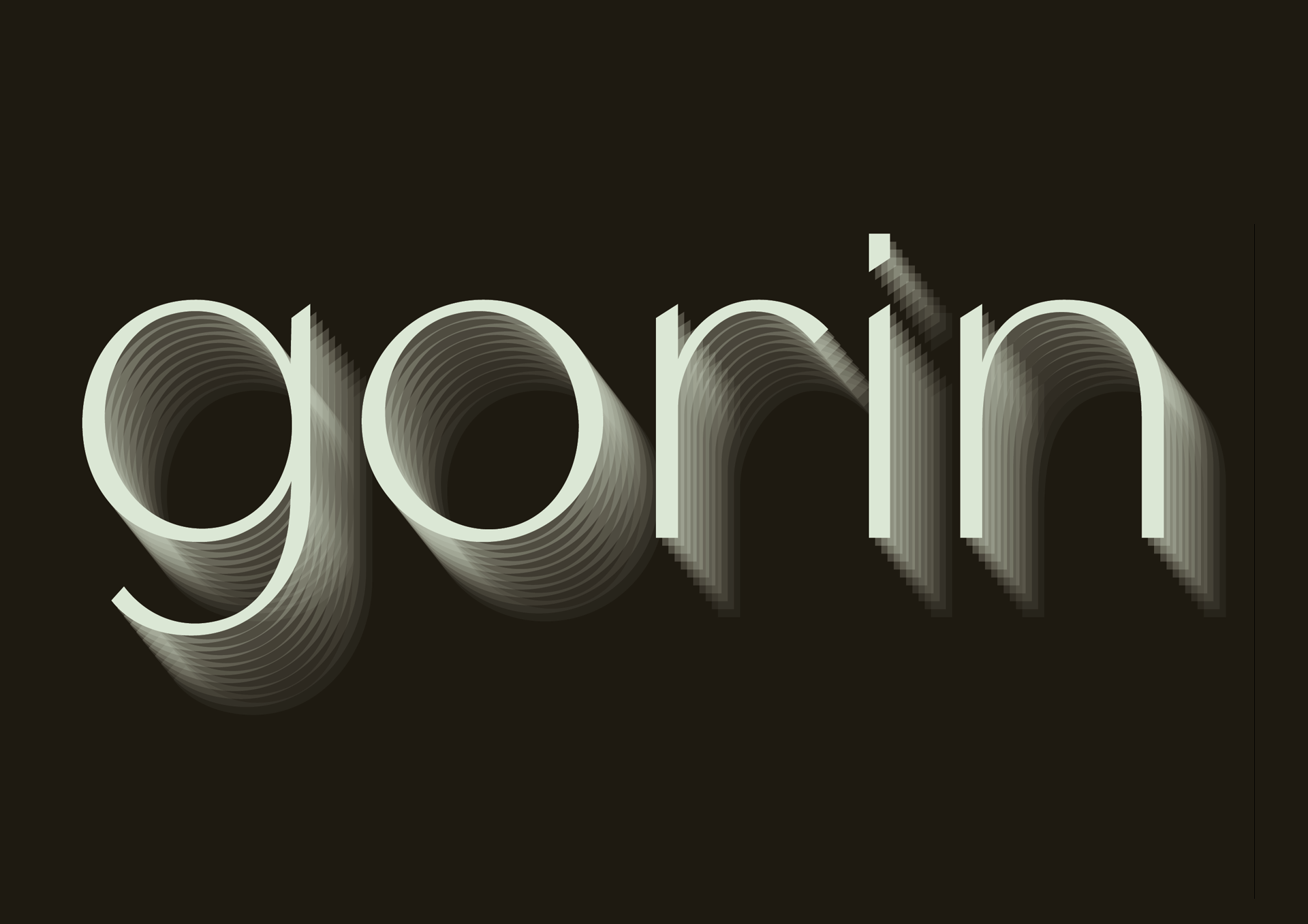
gorin
Type Design Typography Editorial Design
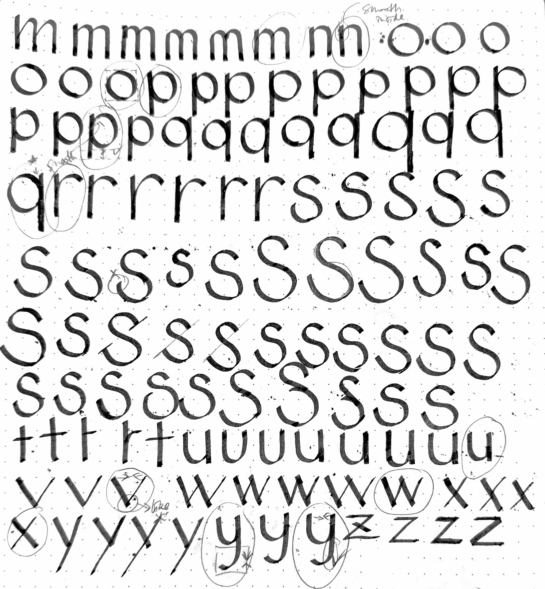
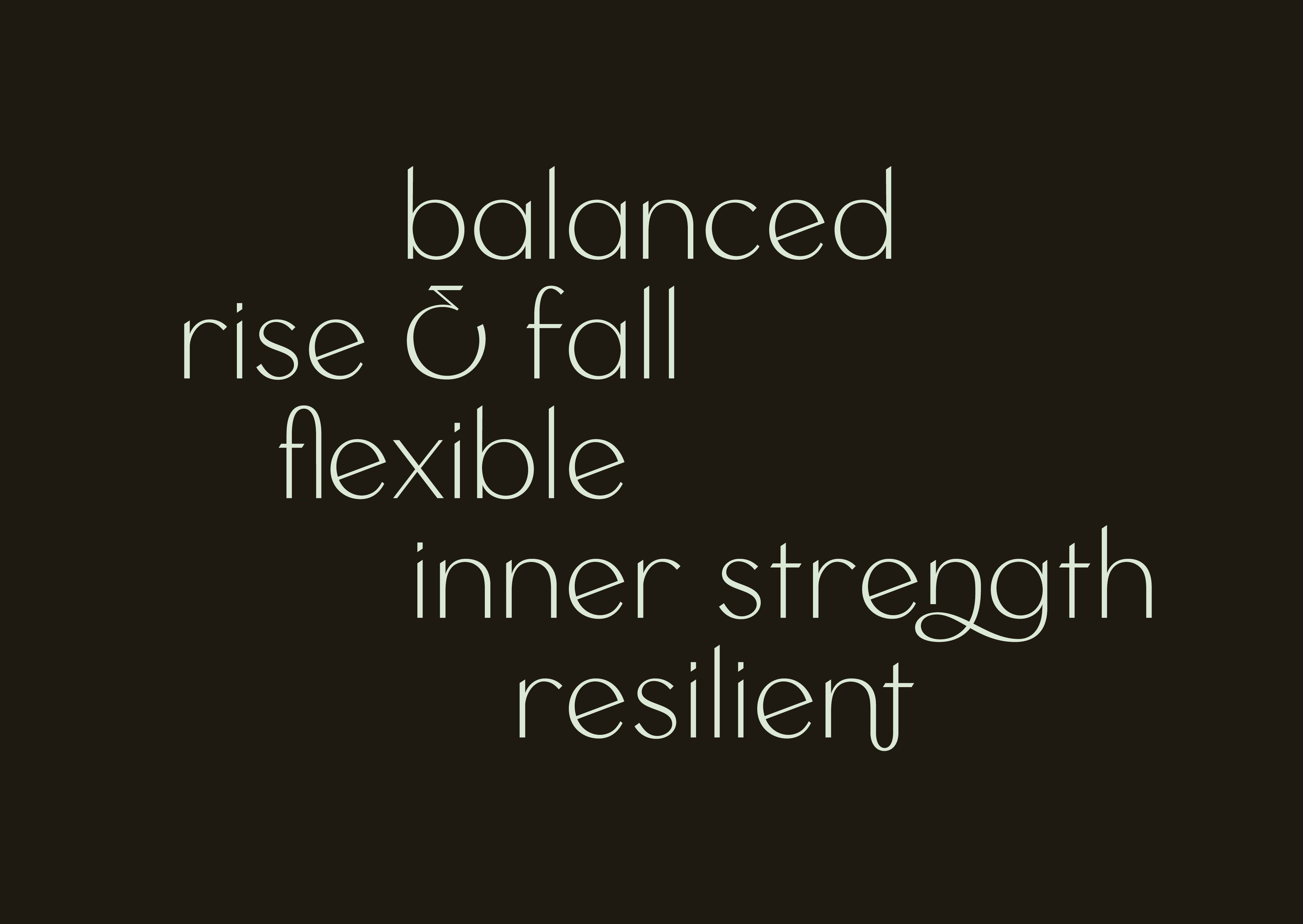
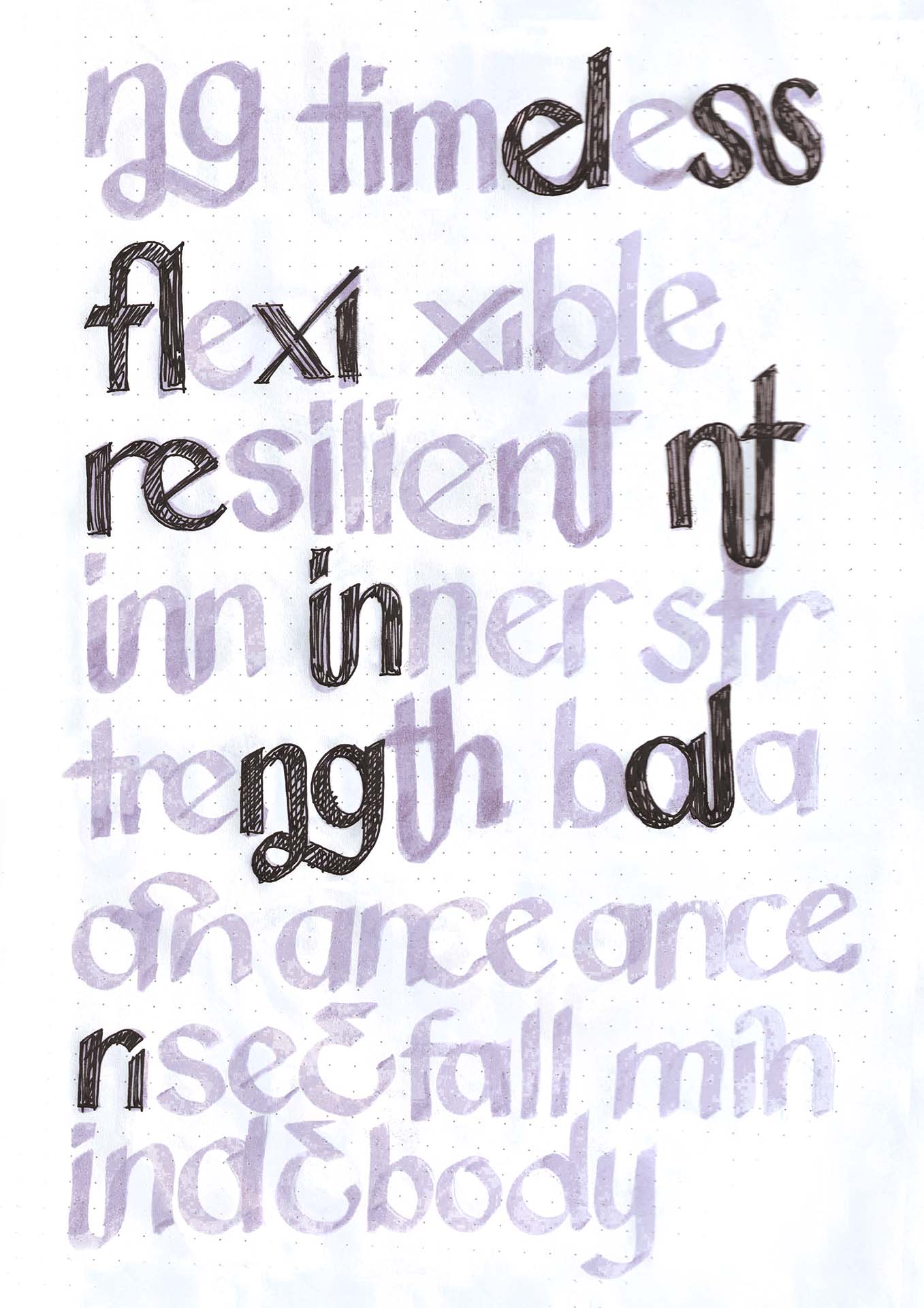
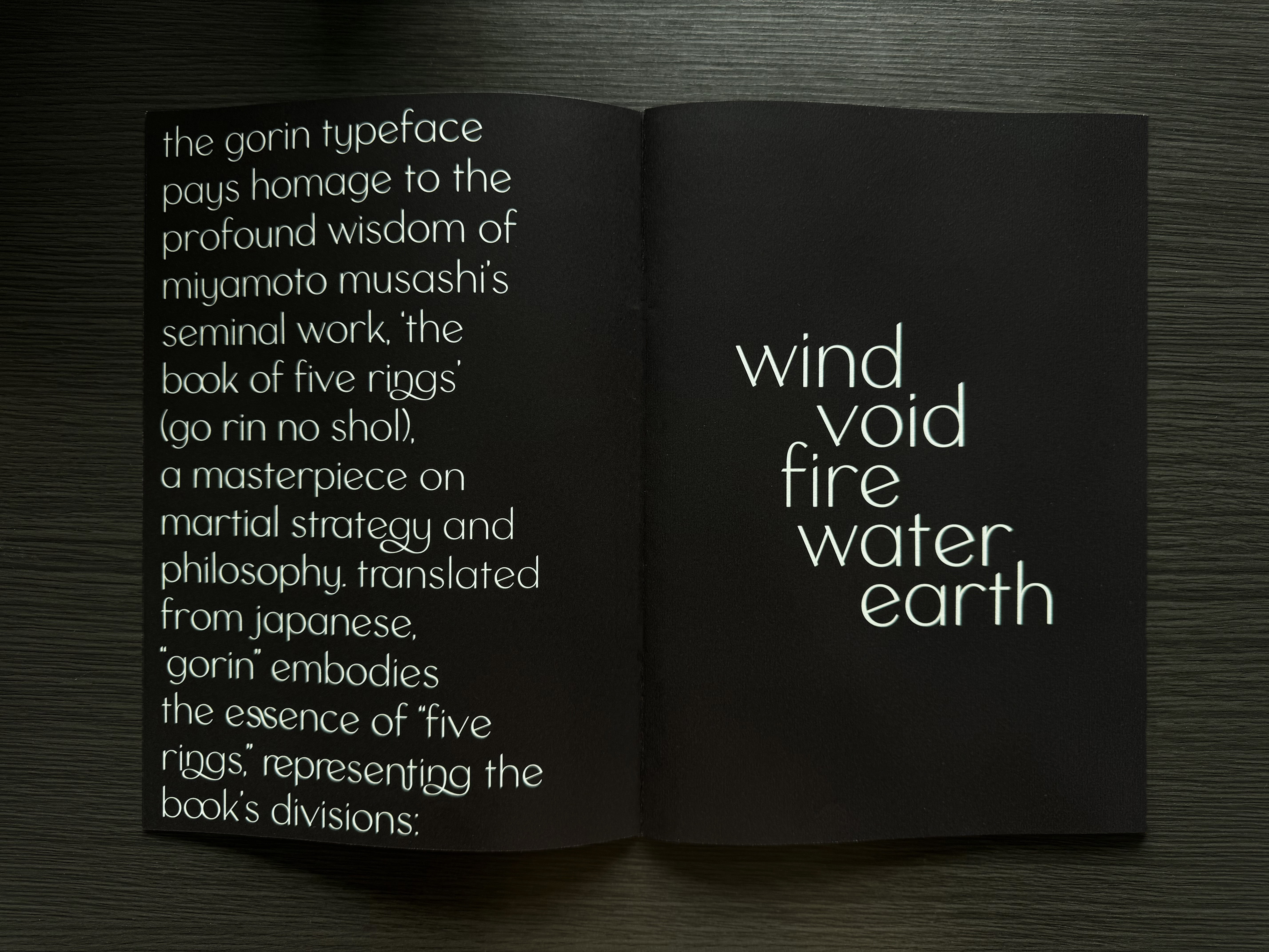
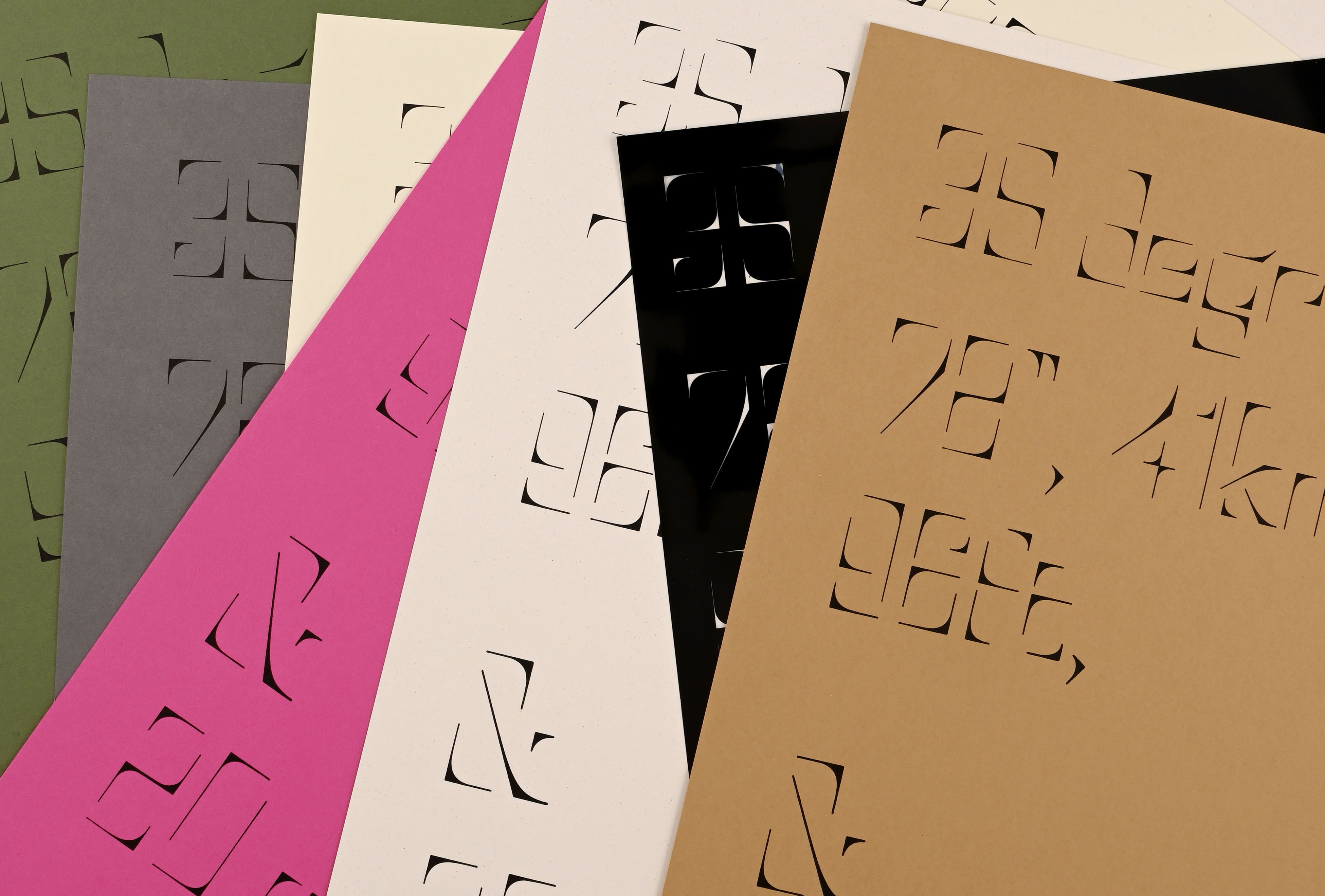
Gorin, a typeface inspired by Miyamoto Musashi's "The Book of Five Rings" (Go Rin No Sho), seeks to encapsulate the profound wisdom and intricate martial philosophy of this classic work. The challenge was to create a typeface that embodies the book's essence—Earth, Water, Fire, Wind, and Void—while translating these concepts into a cohesive visual language. This required a design approach that not only respects the source material but also integrates the martial themes seamlessly into the typeface.
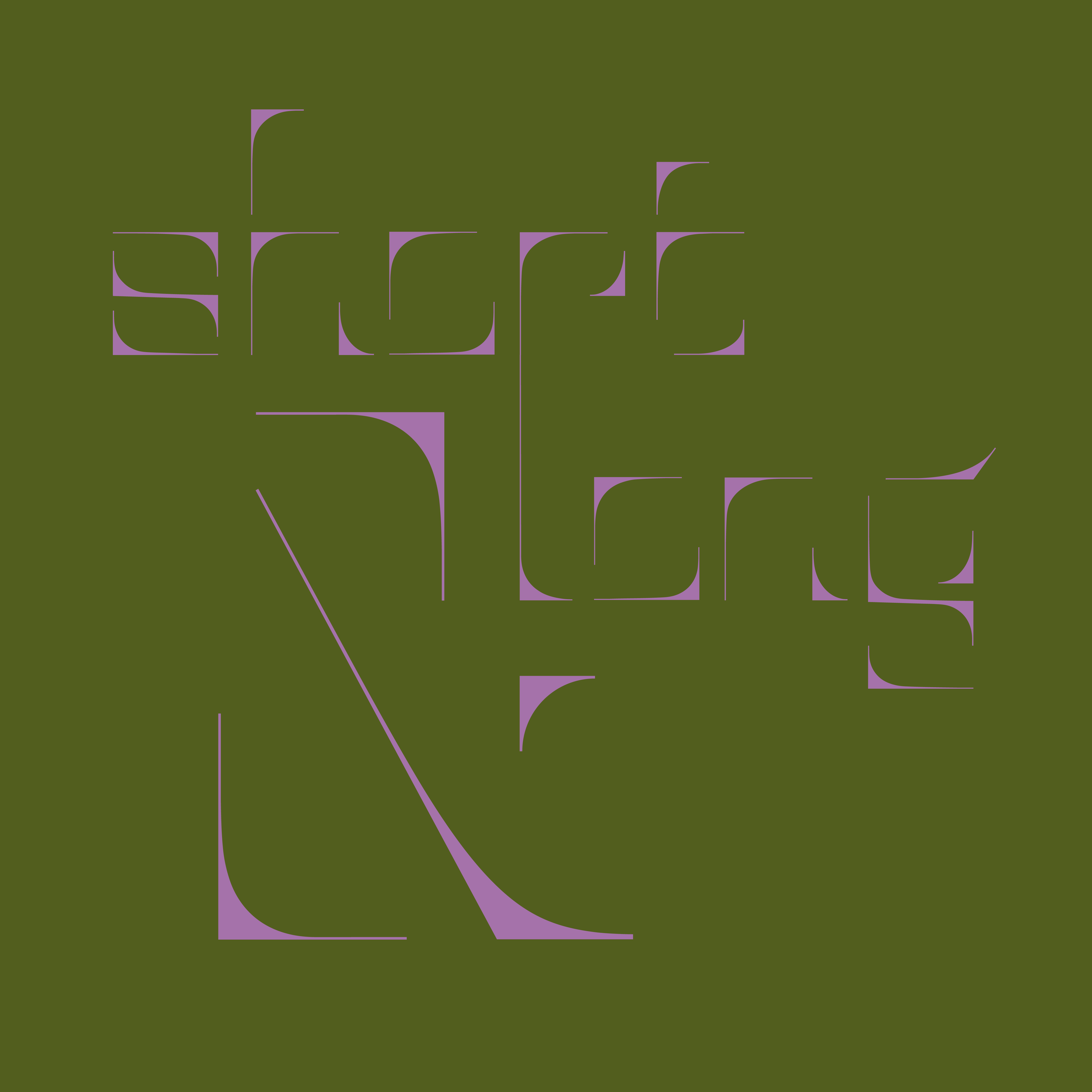
The insight guiding Gorin's design is rooted in the principles of resilience and stability, crucial for a fighter in combat. The typeface's core structure features a tilted counter, symbolizing the chaos often encountered in battle. This design choice necessitated a solution to balance the glyphs harmoniously around this tilted element. The resulting characteristics, such as a low center of mass and diagonal cuts on the ascenders, mimic the grounded stance and precise movements of a swordsman, ensuring that the typeface remains stable and dynamic.
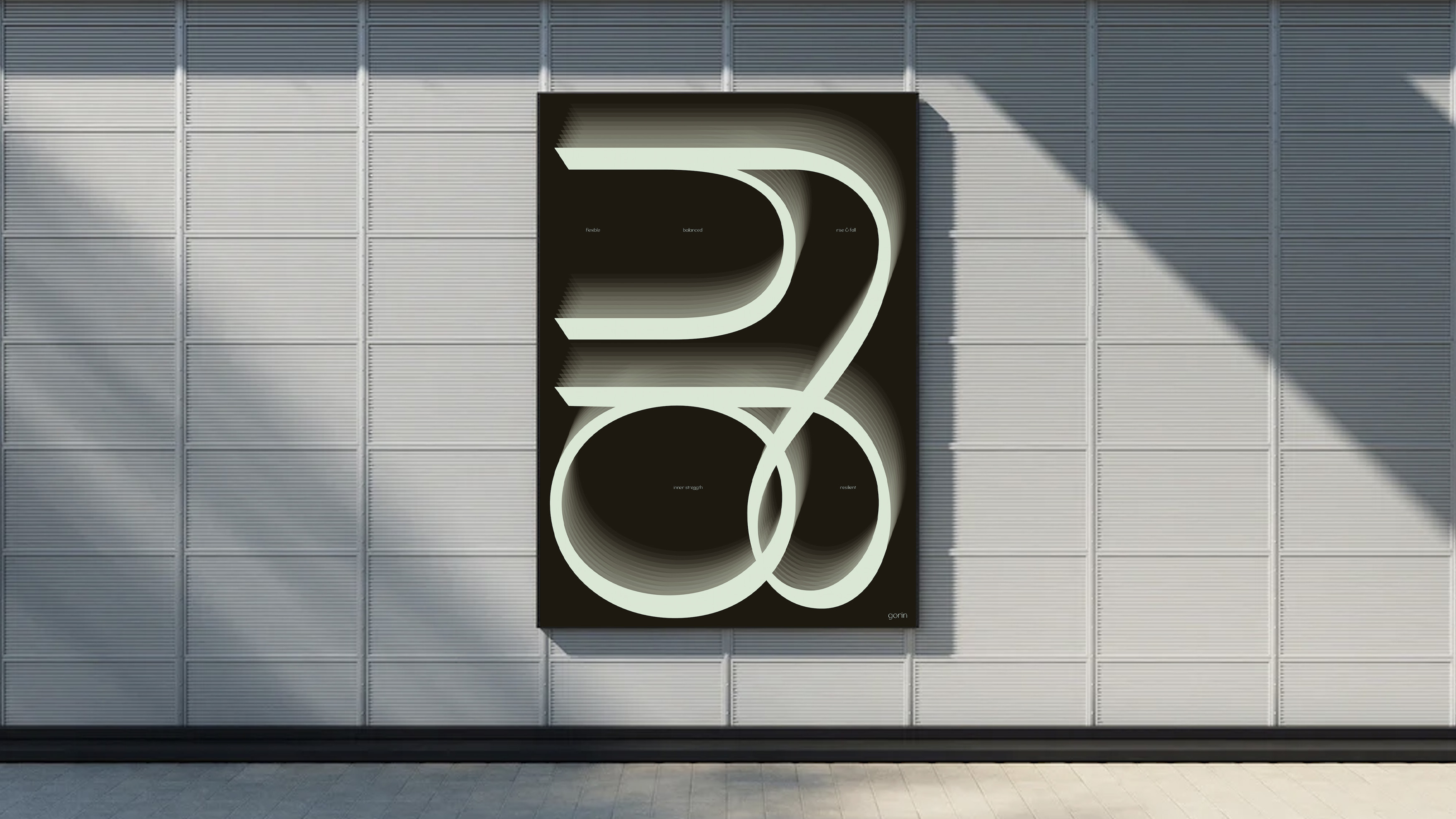
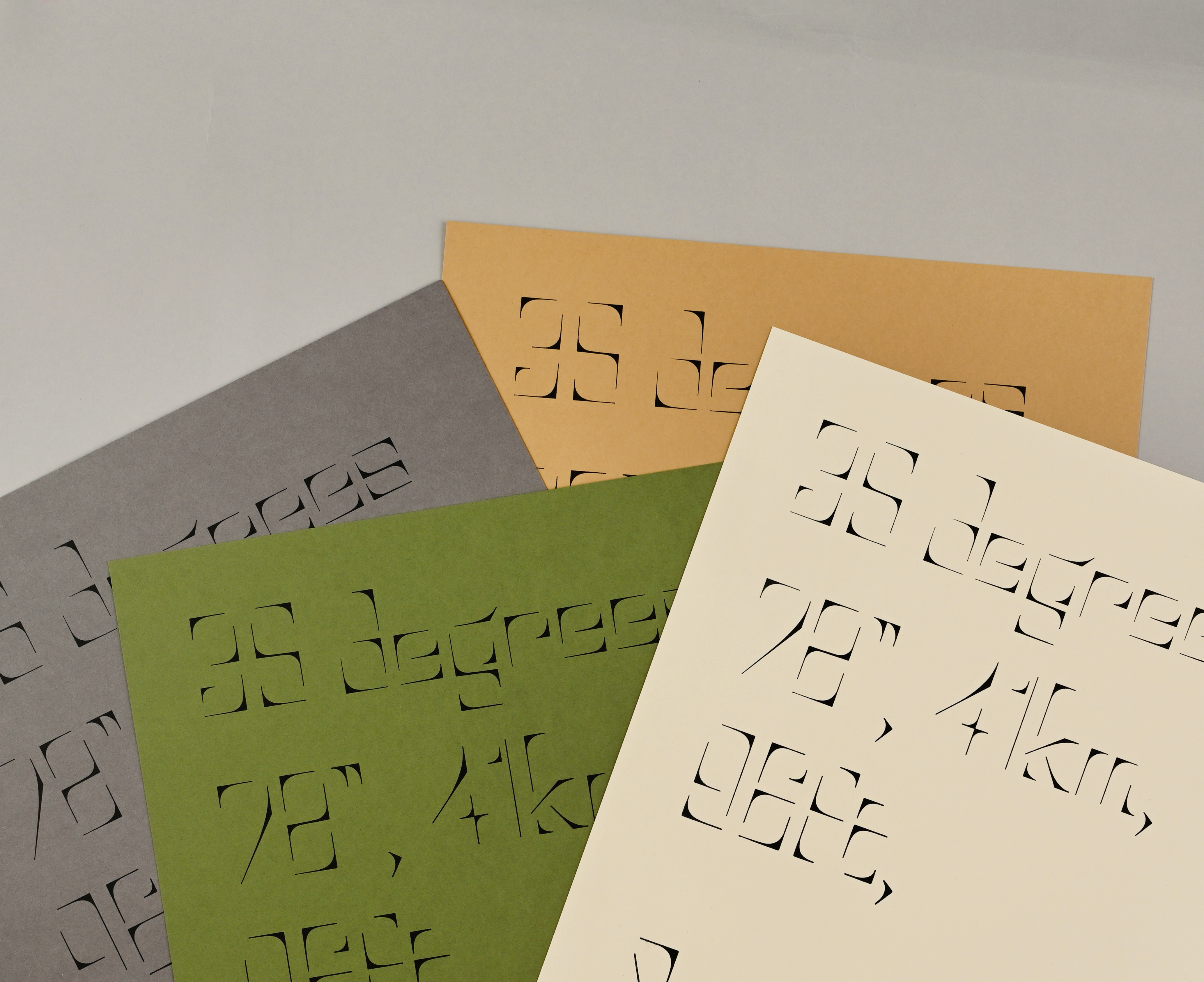
To effectively showcase Gorin's versatility and dynamic qualities, an A1 poster and a type specimen booklet were created. These materials aim to convey the typeface's adaptability through the depiction of combat scenarios and the fluidity of motion. The booklet uses contrasting colors to highlight the essence of fighting, with a mint green background in the middle sections adding a fresh perspective against darker backgrounds. This approach not only demonstrates Gorin's flexibility but also captures the energy and intensity inherent in martial arts.


Desire to Waste
Identity Design Motion Design Web DesignMaterialistic consumption, driven by neuro-marketing and subliminal messaging, significantly impacts the environment. Many consumers are unaware of how their habits contribute to waste and environmental degradation. This lack of awareness perpetuates a cycle of consumption that harms the planet.
The Desire to Waste event at the Victoria and Albert Museum aims to shed light on these issues, inviting the audience to explore the reality behind their consumption habits and inspiring more conscious consumer behavior. The event’s visual identity is centered around waste acetate, symbolizing the material waste generated by consumerism. This choice highlights the tangible consequences of excessive consumption.
To effectively communicate this message, a strict grid system is applied across all deliverables, maintaining consistency and clarity. A distinctive void in the bottom left corner of each design element represents the environmental void created by excessive consumption, with no texts arranged in this area to allow the texture of acetate to shine through. This cohesive design approach encourages attendees to reflect on their impact on the environment through their experience in the event, promoting more sustainable consumer habits.
Sudoku Personas
Typography Motion Design Sound Design
Introducing Sudoku to a new audience through experiencing the game journey with Sudoku Personas - Candidate, X-Wing and Sashimi.
Candidate is an enthusiastic and experienced participant in the competition of Sudoku.
X-Wing is a mysterious and arrogant assassin who slices through the numbers.
Sashimi is a calm and efficient advanced player, it quietly awaits for its chance to attack by figuring out the relationships between candidates in its head.


space
Letterpress Motion Design Type Design
The space typeface was inspired by photographs of intriguing spaces. The problem observed was how thresholds and corners significantly impact space composition, defining wide and confined areas. This observation highlighted the role of corners in shaping the perception of space.
The insight led to the idea of creating a typeface from these corner elements. By incorporating contrasting angles and strokes that fade into the air, the typeface captures the essence of corners while disregarding traditional boundaries. This design approach emphasizes the power of corners in defining space without being constrained by them.
The solution was to print the typeface using letterpress, where the act of mark-making becomes prominent. Printing these corner-based glyphs on paper creates the effect of adding frames, thus imposing a definition on the open space of the sheet. This method underscores the typeface's unique ability to both define and transcend spatial boundaries.


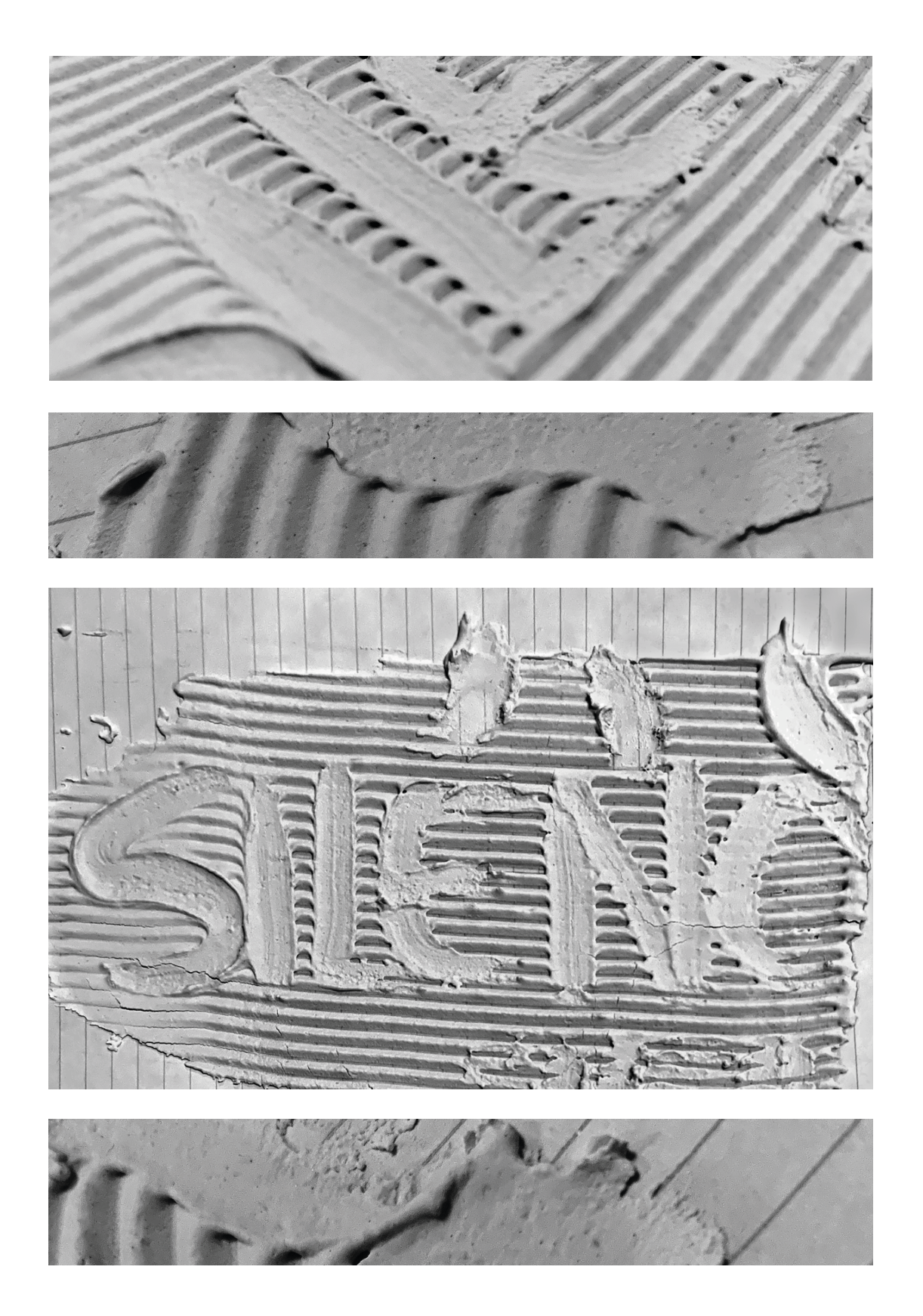
Silence
Art Direction Environmental Graphic Signage Design
The brief was to create an environmental graphic for a tunnel in Tower Hill, London. During a site visit, the tunnel's sound environment was notable, as it felt noisy despite no active interactions. This observation highlighted the ever-present ambient noise within the tunnel.
Inspired by John Cage’s philosophy in his piece '4’33,’ which demonstrates that absolute silence doesn’t exist, the insight was to reflect on the ‘fragments of sounds that lacked attention’. Cage’s piece, silent for four minutes and thirty-three seconds, reveals that silence is filled with sounds that often go unrecognized.
The solution was to create a typography intervention using textured artex to spell out the word "silence." This design juxtaposes the concept of silence with a textured, constructed form, visualizing the tunnel’s soundscape. This graphic invites passersby to experience and perceive the ambient noise from a new perspective.